If your sign needs a sign explaining the sign then it’s a poorly-designed sign.
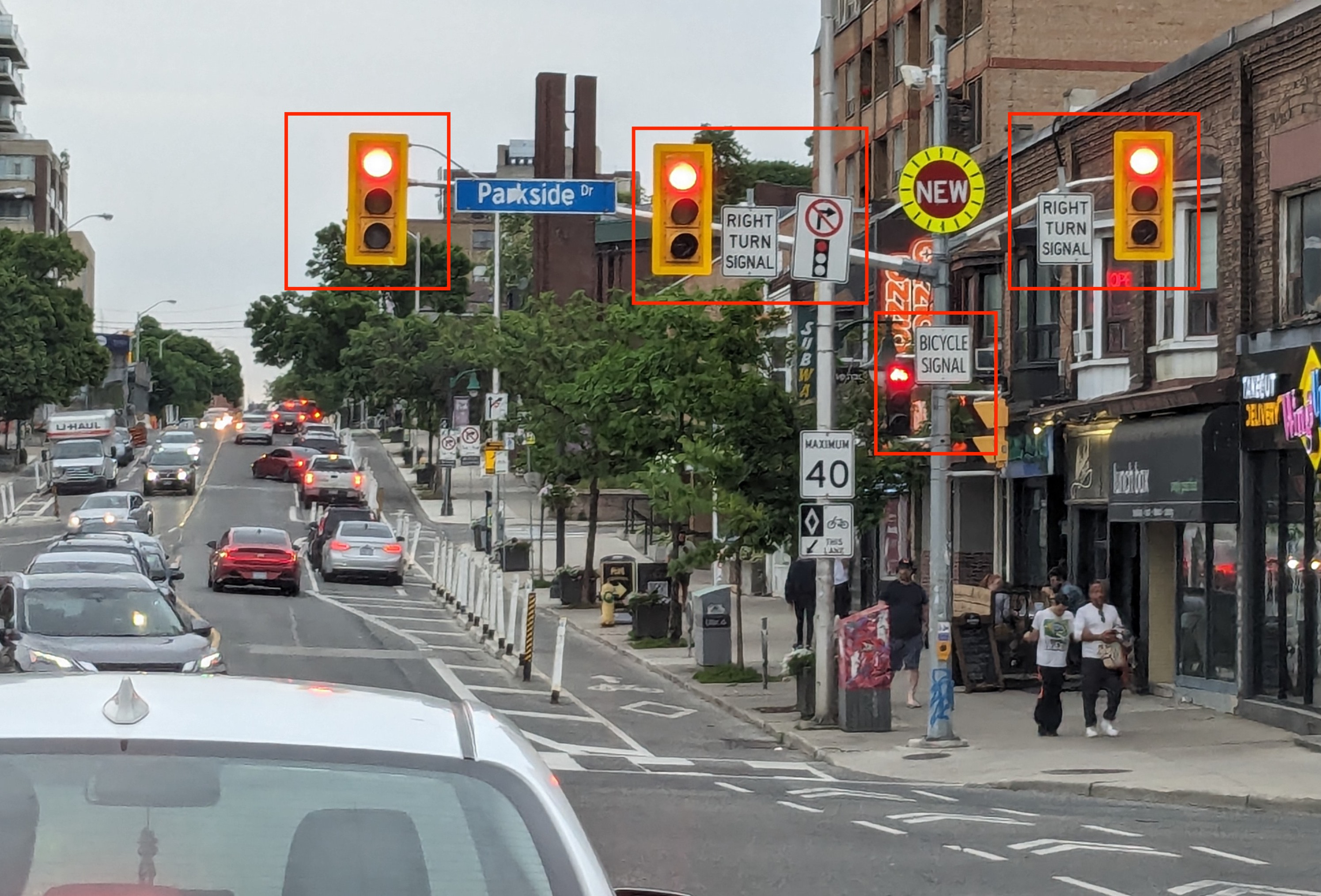
Let me present a few examples. I’ll start with the intersection at Bloor and Parkside in Toronto shown below.

There are four lights in this image: one for the through traffic, one for the cyclists, and two for the right-turn traffic. Both the bicycle signal and the right-turn signal have additional signs adjacent to them explaining what those lights are for. The placement of these explanatory signs is inconsistent: two are to the right of the signal, one is to its left.
These explanatory signs are only in English despite the fact that Canada is a bilingual country and Toronto has a large population of non-English speakers.
The sign explaining the bicyle signal is unnecessary because the signal itself shaped like a bicycle so this just adds to the cognitive load of road users when approaching this intersection.
When red, the right-turn signals are indistinguishable from the signal for the through traffic. When green, however, they show a green arrow pointing right. If the red right-turn signals were red arrows then the “Right Turn Signal” signs wouldn’t be required at all.
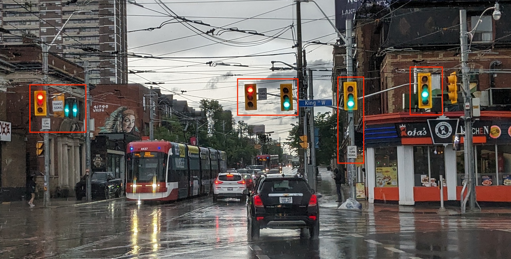
Let’s take another example, this time at the newly redesigned King, Queen, Queensway, and Roncesvalles intersection. The City spent the better part of three years designing and reconstructing this intersection and managed to make it even worse than it was before.

Here we have seven traffic signals. The cognitive load for road users is off the charts. It’s so bad that when some of the lights turn green, the traffic just sits there utterly confused as to who is allowed to move.
The left turn signals are signed because they’re indistinguishable from any other signal. The signage would be unnecessary if the lights themselves were arrows pointing left.
Inexplicably, the right-turn signals are not signed. In fact, one of them is signed as a “Left Turn Signal” even though it’s actually a right-turn signal, but I suspect nobody notices that sign because it’s about 6 feet below the signal. Again, these should be arrows, not solid lights.
One of the left-turn signals is placed above the through street (Queen) which confuses the through traffic that should be watching the signal to its right.
Given the sheer number of lights here, the through traffic signal should be an upwards-pointing arrow so that it’s clear what it’s for. And the transit signal should be a T like it is in many other parts of the City.
This cluttered layout of signals adds to the stress of driving in Toronto. It makes people feel stupid when they can’t figure out what the signals are for. The locals angrily honk their horns at the KQQR newbies that sit perplexed and confused when the lights change.
Can we just use lit arrows for the turn signals, please?